1) In what ways does your media product use,
develop or challenge forms and conventions of real media products?

 At A2 level, the task was to produce a music
promo for a song from an unsigned band. We had to undertake an effective research
and planning to ensure that our music promo is of a good quality. Then, we had
two days to shoot and make plenty of stills. We than had to edit our foot
At A2 level, the task was to produce a music
promo for a song from an unsigned band. We had to undertake an effective research
and planning to ensure that our music promo is of a good quality. Then, we had
two days to shoot and make plenty of stills. We than had to edit our foot
age,
based on our judgment of the best shots. Finally we concentrated on the
ancillary tasks, which included making a digipak and a magazine advert, using Photoshop
and our remaining stills, ensuring that there is a clear link between the
production and the ancillary task. The purpose of these three elements is to
advertise, and promote the band’s music video, thus they should have a clear
link between them, creating a brand identity.
To provide a visual
interpretation of a song
To provide a visual interpretation of song
|
What should be in
music videos…
Performance-
The performance in a music promo is key in
music video. This is because the artists either provide the performance-
(different shots of the artist singing on stage), the story or even both. In
the performance, the camera work revolves around the singers/ guitar players:
 This
is a performance from one of our main inspiration- The Pierces. This is a close
up shot, showing in detail the lead singer singing. This is conventional for
this genre, because performers act as a role model for the target audience and
so attention to close detail is vital. It also shows them credibility as a
musician.
This
is a performance from one of our main inspiration- The Pierces. This is a close
up shot, showing in detail the lead singer singing. This is conventional for
this genre, because performers act as a role model for the target audience and
so attention to close detail is vital. It also shows them credibility as a
musician.
This is a close up shot of Laura performing. It is a little
bit closer than the shot above, but the composition is similar- as we can see
the microphone and the performer’s face and thus, we have been following the
conventions.
The both shots are used here to show the underline the
meaning of the song. This is because the close up shots like this enables the
audience to see the artist’s emotions in the face.
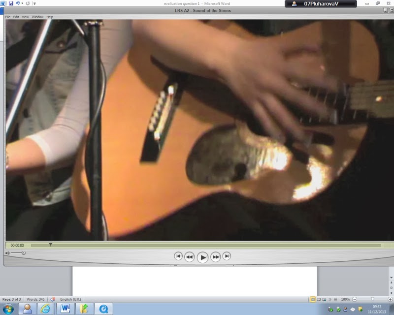
This is a mid-shot of someone from the band playing a
guitar. This is so that the audience can
see the skills of the people in the band, again the performer acting as a role
model to the target market. It is also used to emphasize on the guitar in the
actual song too, which shows skills as a musician and that represents them as
an organised band, for example competitive musicians.
I have also noticed that this is one of the shots that they
have started their performance.
And this is our opening shot. We had decided to use this, to
emphasize on the beat of the song at the beginning. It also introduces the song
well because straight away, the audience will get to know their genre, so it
was reinforced through editing.
Actors/ narrative
The narrative
has 3 different purposes; to amplify, illustrate or create disjuncture with the
lyrics. Whilst using disjuncture, we are not making/ relating any clear link to
the text/lyrics what so ever: Amplification is very closely linked disjuncture;
however, it has a message linked to its primary product and thus, works really
well in advertising. If we are illustrating our lyrics, we are making the
lyrics a reality and therefore illustrating them in the music video. This is
effective because it emphasizes on what is mentioned in the text, which can
create an additional feeling such as emotions/ laughter. We have used a
narrative of emotion as we feel sorry for the girl that seeks freedom from her
boyfriend.
This is a mid-shot of an actor in their chosen location in a
music video. The location appears to be a graveyard, metaphorically amplifying
the lyrics of their song. Also, the location adds a sense of grievance.

This is a close up shot of Laura from when she first
discovers where she is. Although it is not in a graveyard, we can see the
greenery of the place that is suggesting freedom. As we can see the actor is a
female too and also the performer. However, the Pierces usually just sing the
whole son as a narrative, or as a performance, whereas we have done both. Also,
it is conventional for the performer to be in a narrative and thus that is what
we have chosen.
Camera work
In music video,
the camera requires a wide variety of shots to ensure that they cover the
length of the music videos. The shots that predominate are close up shots, long
shots, low and high angle shots. The bigger the range of different shots, the
more appealing it will be to the audience. There are several types of camera
shots:
High angle shot
 I have found this artist called Bob Dylan and he too is
using folk genre. This is a high angle shot of him swinging upside down-
perhaps not following the conventions of a folk genre because he is dressed as
if he was a rapper and the camera work is emphasizing on this.
I have found this artist called Bob Dylan and he too is
using folk genre. This is a high angle shot of him swinging upside down-
perhaps not following the conventions of a folk genre because he is dressed as
if he was a rapper and the camera work is emphasizing on this.
This is also quite an unconventional high angle shot for a
promo. I have climbed up on a ladder which was laid against the tree. However unconventional it may be, I felt that
it works well as it illustrates the text and the idea of freedom.
 This is a close up shot of Ellie’s face. Here we can see the
lights in the background, which reflects on her album cover and magazine advert
too. This has been done to remind us what album this song belongs to, following
a theme of lights throughout.
This is a close up shot of Ellie’s face. Here we can see the
lights in the background, which reflects on her album cover and magazine advert
too. This has been done to remind us what album this song belongs to, following
a theme of lights throughout.
The use of
low angle shots in both the screen shots shows the convention of a similar
genre. The head up from a low angle emphasizes on the fact that the actor is
seeking freedom and almost “praying” for it.
We have used symbolism in our video which we have followed
upon in our digipak. These would be symbolism in a form of leaves to represent
nature and purity, again, emphasizing on freedom and having enough oxygen
around to be able to breath.
Editing


The editing
in a music promo has to reflect on the pace of the beat, which would then
emphasize on the music, adding more meaning to the lyrics. Also, it is useful
to use transitions appropriately and straight cuts for it will make the video
seem more in place and be less difficult to understand for the audience. The
synching has to be precise otherwise the music video would look awful.
This is a
straight cut after 0.8 seconds and thus the transition between the two cuts is
quick. This could suggest that the second shot (the shot of the feet) are just
a flashback or perhaps another story. This is effective in music videos because
it is only gives the audience a bit of information at a time, rather revealing
the full narrative at the beginning- because it gives the audience an incentive
of the sub narrative and keeps them interested in the video.
 This
is also a straight cut; however we have not started using these so early on in
the music video unlike the Ellie Goulding music video. In addition, our cuts in
this section of the promo only last 0.2 seconds and this is because it
illustrates the lyrics: “Why oh Why oh Why” – each “Why” has a 0.2 seconds
break in between them. This is conventional because it adds pace to the music
video, making it more pleasing to the audience.
This
is also a straight cut; however we have not started using these so early on in
the music video unlike the Ellie Goulding music video. In addition, our cuts in
this section of the promo only last 0.2 seconds and this is because it
illustrates the lyrics: “Why oh Why oh Why” – each “Why” has a 0.2 seconds
break in between them. This is conventional because it adds pace to the music
video, making it more pleasing to the audience.
Mise-en-scene
Mise-en-scene has to relate to the genre of the music promo, otherwise it would not make any sense. For example; we cannot have the actors dressed like rock stars in a folk music video- unless we want to create disjuncture.
The actor and the performer in this music video is
wearing a slightly pink dress, which also matches her slightly pink hair.
This shows feminine nature which also affects her target audience that are
most probably females. However it does match the genre of the song (pop)
and therefore is conventional.
 
We do not see any props in this screenshot, perhaps
indicating that due to the song being quite slow, Ellie did not need much
props and the lyrics do not require it.
However the same cannot be said about the location that
she has chosen: It is a location that has been well thought about with
plenty of lighting around, to again, emphasize on the purity and hope.
|
Costumes
 We have chosen to
wear country style clothes because it matches the folk genre and also the prop-
which is a guitar. We have also taken our inspiration from the Sound Of the
Sirens themselves to illustrate importance of costumes in a music promo. It is
important that we dress for the genre because it would not make sense otherwise
and makes the lyrics more believable.
We have chosen to
wear country style clothes because it matches the folk genre and also the prop-
which is a guitar. We have also taken our inspiration from the Sound Of the
Sirens themselves to illustrate importance of costumes in a music promo. It is
important that we dress for the genre because it would not make sense otherwise
and makes the lyrics more believable.
Our genre is folk/ acoustic
Sounds Like: Mumford and Sons,
Bombay Bicycle club, Destiny's Child
Acoustic music compromises music
that solely or primarily uses instruments and performance and folk music- Is an
English term encompassing both traditional folk music and contemporary folk
music. The term originated from 19th century. Traditional folk music has been
defined in several ways; as music transmitted by mouth, as music of the lower
classes, and as music with unknown composers. It has been contrasted with
commercial and classical styles.
Our inspiration
We took an inspiration from The Pierces
because we have two girls in our music video to do performance, of which one is
a brunette and the other is blond. The genre of the music is the same too,
which enables us to get good ideas from them.
The Pierces had also used quite a lot of
mid shots and two shots in their music video, so we have done the same. This is
also because mid shot allows the audience to see us performing with the guitars
in the shot. This also suggests equality between the two performers as we are
both at the same level in the shot.
This
two shot shows control over another person as we can see that the girl is
painting the other girl’s nails, looking after her, and this creates a sense of
obsession.

We have also used a two shot (slight high
angle), so that the audience can see that the boy is looking through his
girlfriend’s phone, also showing a sense of control and obsession.
 This is the location that we have used for the
performance.
We have chosen the drama studio to do the
performance because it had the stage available, the mikes and the lighting
which is vital in all of the music promos. We have used the inspiration from
Sound of The Sirens themselves as we have found a video of them doing a live
performance, which looks similar- except that theirs is outside-but it was cold
that day
This is the location that we have used for the
performance.
We have chosen the drama studio to do the
performance because it had the stage available, the mikes and the lighting
which is vital in all of the music promos. We have used the inspiration from
Sound of The Sirens themselves as we have found a video of them doing a live
performance, which looks similar- except that theirs is outside-but it was cold
that day
We have to be careful with our composition whilst shooting, to make our
video too seem like a live performance. The lights have also helped us to do
so. We have used lights so that it looks like it has been shot in a proper
venue. We focused the lights mainly on us- the performers so that the audience
can see us clearly.
.
This is our first narrative location.

This is our first narrative location. It is called Shillingthorpe Park
and we have chosen this location so that
we have plenty of nature around us. This is mainly to create a contrast between
the purity of nature and the obsession of their relationship. However at the
same time, it underlines the freedom that the girl has, now that she is away
from her obsessive partner. This location provides us with both hills and also
flat ground to show the big space around her.
 Our third and final location is Laura’s house. We have chosen this
location so that the audience can see why the actor is craving for freedom and
where their arguments have stemmed from, creating a link between the two
narratives. Our location shows the use of conventions because every location
has a similar meaning to the lyrics of the song, highlighting and amplifying
the lyrics.
Our third and final location is Laura’s house. We have chosen this
location so that the audience can see why the actor is craving for freedom and
where their arguments have stemmed from, creating a link between the two
narratives. Our location shows the use of conventions because every location
has a similar meaning to the lyrics of the song, highlighting and amplifying
the lyrics.
Editing techniques used in our promo / narrative and
performance–editor’s commentary draft
only
-Straight cuts are used frequently and efficiently according
to the beat of the song and the lyrics and to show a wide variety of shots as
effectively as possible; for example we have used variety of shots right at the
beginning with the tempo of the song. (Every beat= different shot of us playing
the guitar)This is where the cutting technique was faster. This is effective
because it emphasizes on the beat and keeps interest.
-We have used editing timing to put the burst stills
together from the camera. We have set it to 0.2 seconds, so that the transition
between each still keeps up the beat, but looks effective for the genre of the
song. This is mainly because burst helps to create a gap between each shot,
creating a motion to the video, making it more appealing to the audience.
-The black and white effect in the narrative at Laura’s
house helps the audience to distinguish the fact that this narrative is a
memory or flashback. It also provides variation for the music promo as not all
the clips are the same.
-The “spin in” transition effect - the only transition that
we have used in our promo. We have chosen this because it highlights and
illustrates the lyrics- “it’s started to sink”.
-We have maintained a good balance in our promo between the
narrative and the performance. This is the most noticeable when every time the chorus
plays the promo changes between the narrative and the performance. This is to
keep a good variation in scenes, rather than just having one on its own.
Key shots
This is one of our key shots because it is the first shot
that the audience will se. The close up shot helps to emphasize on the beat of
the song, which at the beginning is quite catchy anyway. I also like it because
it does not reveal too much at the start of the video, keeping the audience
keen to kep watching.
 This is
a low angle shot of Laura that is just about to sing the first lyrics. This is
an important shot because it shows the performers individually for the first
time and the low angle shot gives Laura a sense of confidence and in control.
This is
a low angle shot of Laura that is just about to sing the first lyrics. This is
an important shot because it shows the performers individually for the first
time and the low angle shot gives Laura a sense of confidence and in control.

This is a mid-shot of Laura’s boyfriend, Chris throwing her
phone. We have emphasized the importance of his actions by slowing the clip
down completely so that the audience can notice his aggression, creating a
sense of dysfunctional relationship via control. It is also low angle towards
Laura, enhancing Chris’s power as a male.
 This
is a low angle shot of Laura, walking through the park. This is important
because it explains that she has now escaped into her own ‘Narnia’ world, where
she is free to do what she likes, and that empowered her as a person and thus
the low angle shot. In this shot we can also see the nature, implying purity
and new beginnings
This
is an ending shot of the couple together, sinking into the dark background.
This metaphorically explains the lyrics ‘it’s started to sink’ and the black
and white enhances on this as it is colour scheme of sadness and tragedy. And
the editing transitions helps to reinforce that
Influences on the ancillary
Our magazine advert and our digipak are quite
similar.
Conventions of magazine advert
 The block letters give the magazine advert a more modern
approach. The red colour suggests danger and blood, which is quite
unconventional as these colours are usually used for rock. This however is
effective because it creates controversy.
The block letters give the magazine advert a more modern
approach. The red colour suggests danger and blood, which is quite
unconventional as these colours are usually used for rock. This however is
effective because it creates controversy.
A
mid shot of the lead singer shows the celebrity and therefore helps
to sell the album. It also allows the audience to recognise the album more
The text (lights reflect on her hair - as she has lights
that reminds us of fairy dust in her hair. This could also reflect on her
feminine personality and also her genre of music- pop.
 The text also shines, again amplifying the title of the
song. The writing is bold and simple, showing that her music is modern. Also,
bright, sparkly style links to pop genre.
The text also shines, again amplifying the title of the
song. The writing is bold and simple, showing that her music is modern. Also,
bright, sparkly style links to pop genre.
Her look is natural, implying that her songs are pure and
perhaps based on a true story.
The image is quite big, allowing us to see the whole of her
face close up. It creates a better effect for the genre of the music and allows
the audience to see the lights in details.
She also uses reviews to show the buyers that this album is
worth buying yet she doesn’t tend to use 5*, keeping the reviews more reliable
and realistic.
 The Pierces were our main inspiration when it came to making
a magazine advert.
The Pierces were our main inspiration when it came to making
a magazine advert.
It is effective because The Pierces show just a close up
shot of the two singers, with an antique effect and their name at the bottom.
No other text is mentioned.
 This
is our first trial of magazine advert. We have chosen a picture of me and Laura
to be on there, so that our audience will see what genre it is- mainly thanks
to those guitars that we are carrying. There is also a link to the performance
in the music promo because these clothes are exactly the same ones as the ones
in the performance. The leaves in the background also link to the narrative of
the promo, especially the in the bit where Laura threw the leaves into the air.
However, looking back at our research, we have decided that this magazine
advert is not good enough for as it does not show the conventions of a folk
genre properly. Hence, we have made some improvements.
This
is our first trial of magazine advert. We have chosen a picture of me and Laura
to be on there, so that our audience will see what genre it is- mainly thanks
to those guitars that we are carrying. There is also a link to the performance
in the music promo because these clothes are exactly the same ones as the ones
in the performance. The leaves in the background also link to the narrative of
the promo, especially the in the bit where Laura threw the leaves into the air.
However, looking back at our research, we have decided that this magazine
advert is not good enough for as it does not show the conventions of a folk
genre properly. Hence, we have made some improvements.

This is our new magazine advert. The writing is more relaxed
and hence is more conventional and more ‘country’ style. The photo shows me and
Laura performing, showing our guitars, which again follow the convention of
folk genre.
For the background we have chosen to use the
leaves and this time in colour. This is because it follows the theme of leaves
through our video and our digipak too.
Conventions of a digipak


 Gabrielle Aplin also used the
similar conventions to our digipak and this is also why we have taken
inspiration from her. It is quite simple same as ours to show the easy going
pop/country genre. She has too used nature in her digipak, to follow the theme
of her songs/music videos. The writing is also quite relaxed, again, complimenting
the conventions of a pop genre.
Gabrielle Aplin also used the
similar conventions to our digipak and this is also why we have taken
inspiration from her. It is quite simple same as ours to show the easy going
pop/country genre. She has too used nature in her digipak, to follow the theme
of her songs/music videos. The writing is also quite relaxed, again, complimenting
the conventions of a pop genre.

This is our final digipak. It is
six panels and five of the six are our own pictures which I took myself and
edited using Pixlr online. When we were deciding which pictures to use we made
sure that they all were similar. This is because we wanted to follow the
convention as link the digipak, music video, and the magazine cover together,
to create a certain theme. We also
decided to use the logo of the actual band as we thought that we should
incorporate them in it in some way. The front panel is the bottom right
picture. We thought that the picture was a simple and beautiful picture which
would show happiness because of the bright colours but because it is simple it
suits the genre as most digipaks and album covers of the folk genre as very
simple. The writing on it is from the website dafont.com. I thought that the
writing was simple and fitted the genre because folk and country music is also
quite simple. However, it also looked good and stood out against the bright background.
The panel next to it is the back panel. I also took that photo when we were at
Shillingthorpe park and I thought that it was so beautiful that it should be
used in our project in some way whether our music video or the advert or the
digipak. I edited it on Pixlr, using a the black fade effect around the edges
as I used on the front panel. It makes the colours of the picture stand out and
makes you look at the picture but also the text that is on it. the text on it
is the names and numbers of the tracks. The first one is our actual track and
the rest are made up as you don't only have one song on a digipak. The panels
next to that is the logo of the actual band. we didn't have any other pictures
that would link with the others so we came up with the idea to use their logo.
Above the logo panel is a picture from when we were doing the performance
video. I cut the background out of the picture and stuck them on a olden wooden
stage that you would see in folk videos and then washed out the colour to give
it an olden photo effect but to make it simple and soft as well. The panel next
to it is where the CD will go. Again I took the photo and edited it to make the
colours bright and stand out and then put the name of the band underneath as if
the band is suddenly being revealed when you take the CD out. The next panel is
a picture of Ronnie and Laura as they are the performers they had to be
included somewhere on the digipak.


 Whilst on the photoshop, i have decided
that i do not want to have the paper background on the CD cover and thus, i
have used the "eraser tool" and erased all the background, untill i
was left with no paper. The writing is now 'not as neat', but decided to keep
it like this because it carries a mysterious look, which goes well with the
theme of sirens
Whilst on the photoshop, i have decided
that i do not want to have the paper background on the CD cover and thus, i
have used the "eraser tool" and erased all the background, untill i
was left with no paper. The writing is now 'not as neat', but decided to keep
it like this because it carries a mysterious look, which goes well with the
theme of sirens
 Now I know pretty much everything that I need to know in order to have a
decent blog. Blogger helps to put all my information down on the internet
rather than on a paper.
Now I know pretty much everything that I need to know in order to have a
decent blog. Blogger helps to put all my information down on the internet
rather than on a paper.
 Prezis are a great way of making
presentation in a very fun way. They have lot of themes, from which some are
3D, making it very realistic to watch. It was hard to use at first, but
eventually I got the hang of it. I have used prezi for analysis, for evaluation
questions and for ISL work. They are brilliant! They are very easy to upload on
my blog for everyone to see in seconds.
Prezis are a great way of making
presentation in a very fun way. They have lot of themes, from which some are
3D, making it very realistic to watch. It was hard to use at first, but
eventually I got the hang of it. I have used prezi for analysis, for evaluation
questions and for ISL work. They are brilliant! They are very easy to upload on
my blog for everyone to see in seconds. I found creately on the internet when I was
looking for something a little bit different. Creately is also free, and has
some very nice templates for spider diagrams and mind maps. They are very
difficult to save (it takes me about 20 minutes to find out how to do it each
time). I learned that I had to save it first into a computer before I could do
anything else. It is a pain, but it’s worth it.
I found creately on the internet when I was
looking for something a little bit different. Creately is also free, and has
some very nice templates for spider diagrams and mind maps. They are very
difficult to save (it takes me about 20 minutes to find out how to do it each
time). I learned that I had to save it first into a computer before I could do
anything else. It is a pain, but it’s worth it.


